Sponsored by Knit Picks. Post contains affiliate links.
How is it that I’m always yammering on about my love of primary colors and dropping 


What is Color Value?
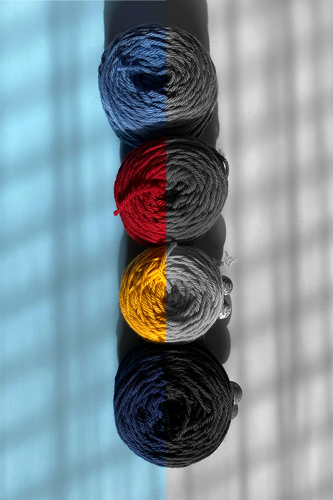
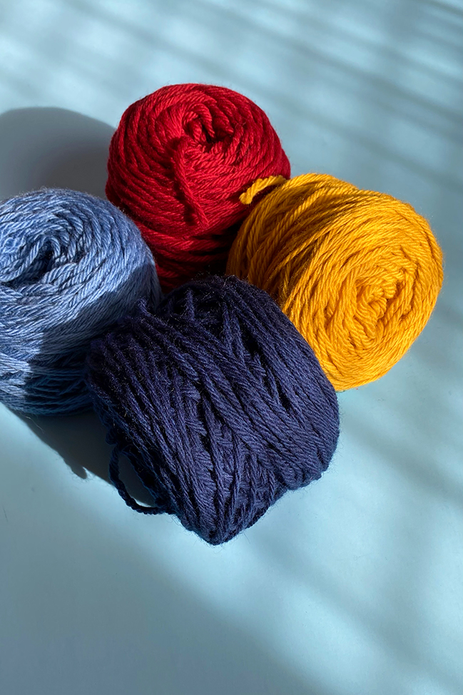
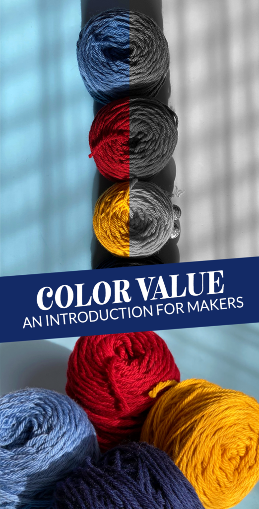
In the video, I explain that black and white photos help makers see the contrast between colors, and that color value can be described as how close to black or white, or how light or dark a color is. But since we’re working with a blog post and not a 30 second video here, let’s dig a little deeper.
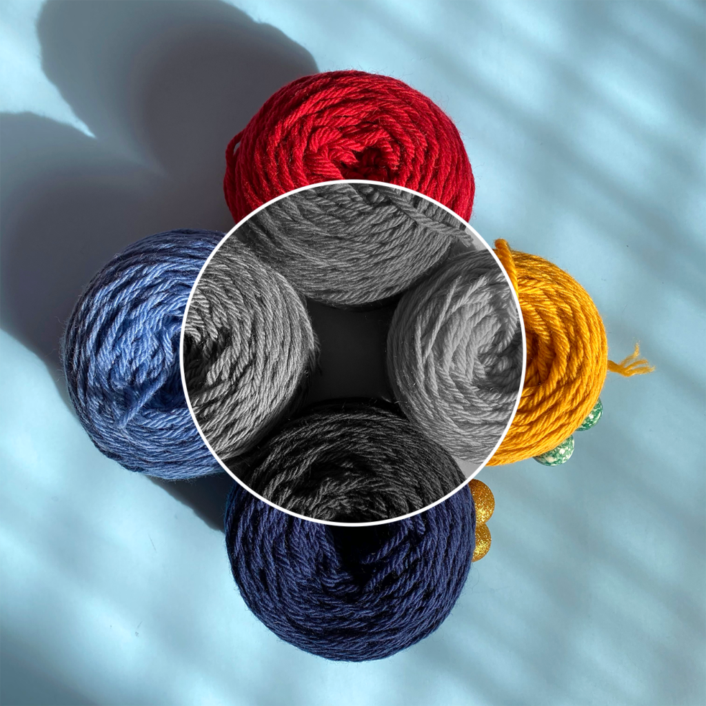
Useful colors to picture for color value
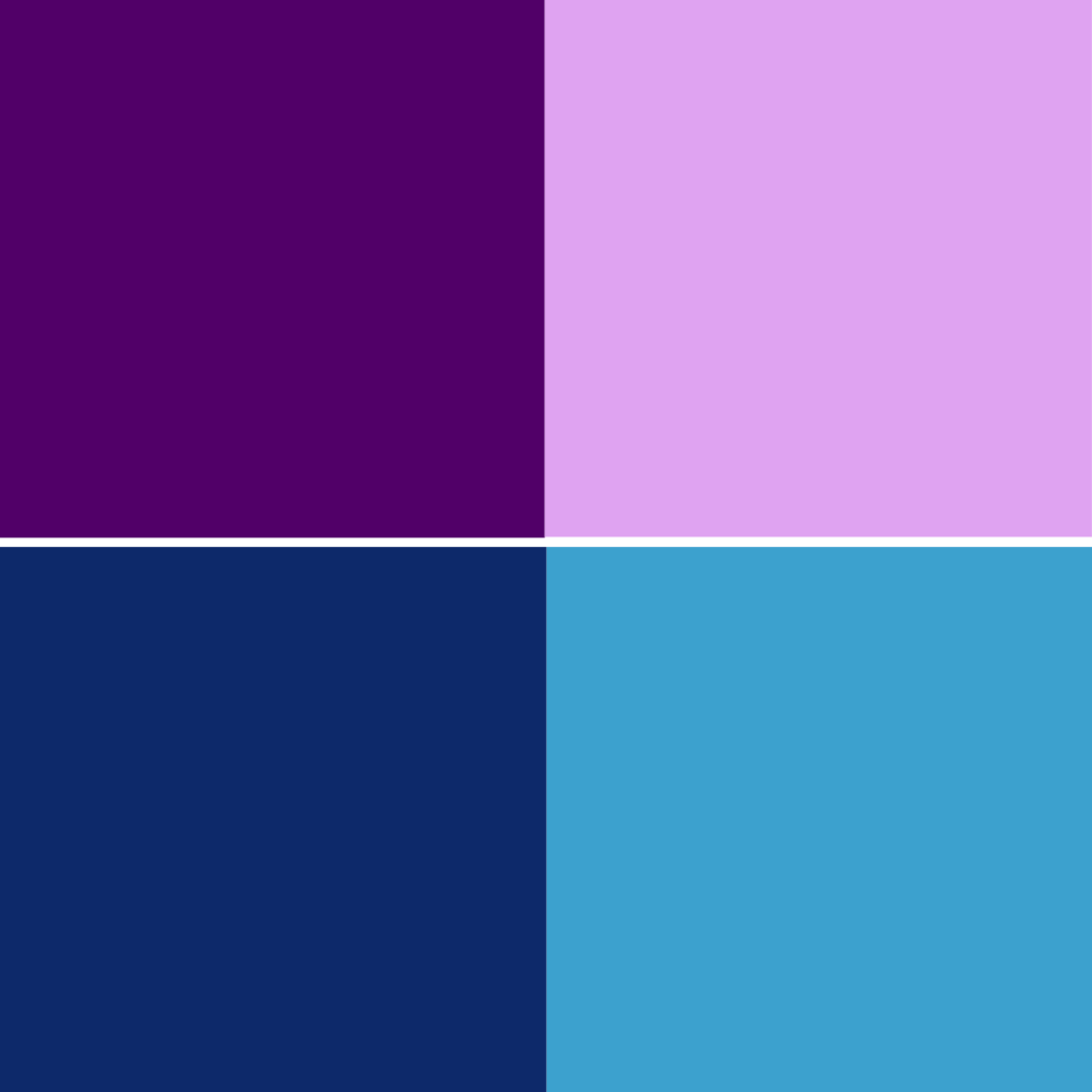

Eggplant/lavender & navy/sky blue are commonly-identifiable colors, easy to picture. They’re also good for explaining the phenomenon that two DIFFERENT colors can have the same/similar value. In this example, eggplant & navy have a more similar color value than lavender & sky blue.
I used my iPhone to convert the above graphic to black and white using one of my phone’s built-in black and white filters. (Here’s how to do that. I recommend the Mono filter.) Here’s the result.
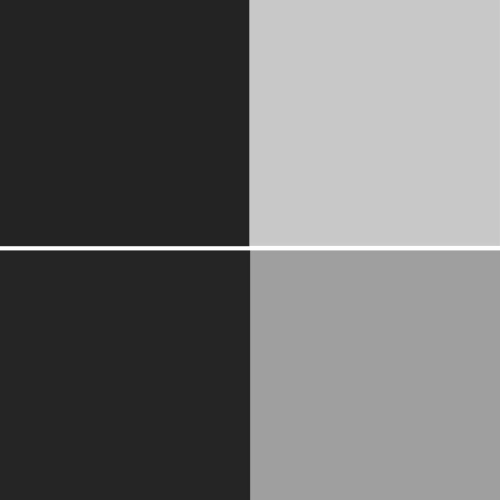
As you can see, when converted to black & white, the eggplant and navy colors have nearly the same color value. And while the lavender and sky blue aren’t quite as close in value, they are closer to each other in value than their darker, same-color counterparts.
Another way to think of these examples: sky blue is another name for LIGHT blue. Navy is another name for DARK blue. Light colors are described as having “higher” value than dark colors. Light colors reflect more light than dark colors, which absorb more light. Light is how the eye perceives color, so that is why you have to care about color value in your making, particularly if you’re combining colors in an effort to make a design discernible to the eye.
Related Reading
I former librarian, I firmly believe in the value of reading about the same concepts, but explained and illustrated in new ways. No two makers have the same context and reference points, so if my explanation on color value isn’t totally clicking with you, or if you want to delve further into reading about color theory before I get around to writing another post, give these links a look:
Color Theory Basics I – Tricksy Knitter
The Value of a Color is in the Gray – Roving Crafters
How to Choose Colors for Fair Isle or Stranded Colorwork Knitting – Berroco Blog
Value in Color Theory – Round Table Yarns
9 Hints for Selecting a Colorwork Palette for Stranded Knitting – Interweave
Colour Theory for Knitters – Tin Can Knits
Color Theory for Stranded Colorwork – Brooklyn Tweed
Sponsored by Knit Picks. Post contains affiliate links.



 & shop new patterns


Leave a Reply