This post is part of our Read Along Knit Along series & is brought to you by LoveKnitting, Eucalan & Knitter’s Pride. Learn about our sponsors and enter to win the RALKAL prize pack here.
BTW: You can still buy Intarsia Mountain kits featuring the original primary and neutral color palettes from LoveKnitting.
A quick reminder of the original Intarsia Mountain palettes
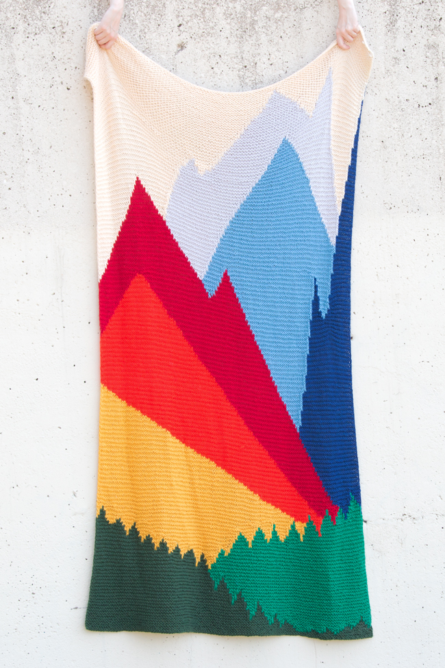
The original, primary color-based Intarsia Mountain color palette.
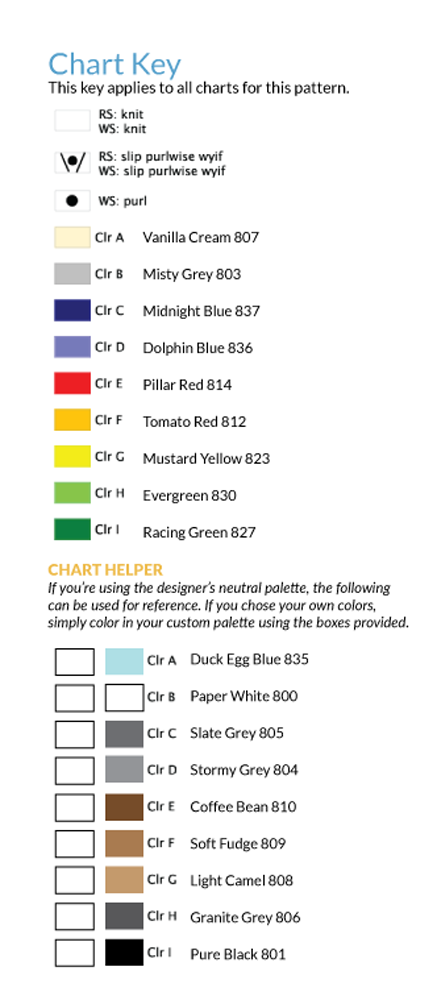
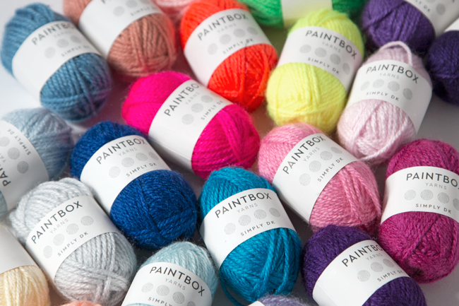
A big part of partnering with Paintbox Yarns for this design was the fact that their Wool Mix Aran yarn is available in 60 colors. I knew that color would be a key component to the success of this design. Colors create the illusion of depth on this otherwise-flat, two-dimensional piece of work. And since this bad boy uses 10 skeins and 9 colors of the same yarn, I needed to work with a yarn that gave knitters (and me as a designer) some options. For reference, the original palettes are pictured above and below, and here’s a look at the names of each color as they appear in the Intarsia Mountain pattern’s chart key.

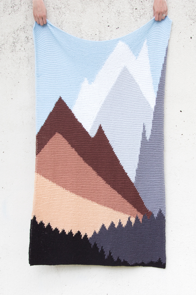
The neutral Intarsia Mountain color palette.
Purple Mountain Majesties
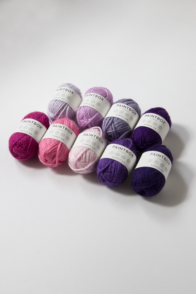
Knitters tend to love their purples! I don’t really now why, but so many yarn companies I’ve worked with talk about how well their purples sell. If you’re one of those knitters who loves a good purple, this Intarsia Mountain color palette is for you! The fuchsia and pink hues take the place of the original design’s warm color mountains, eggplant hues form the tree foundation, and lilacs represent each mountain fading into a light lavender sky.
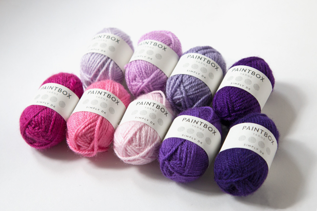
Purple Mountain Majesties color palette
Clr A – Dusty Rose 841
Clr B – Tea Rose 842
Clr C – Rich Mauve 844
Clr D – Dusty Lilac 846
Clr E – Raspberry Pink 843
Clr F – Bubblegum Pink 850
Clr G – Candyfloss Pink 849
Clr H – Pansy Purple 847
Clr I – Dark Aubergine 848
Dayglow Landscape
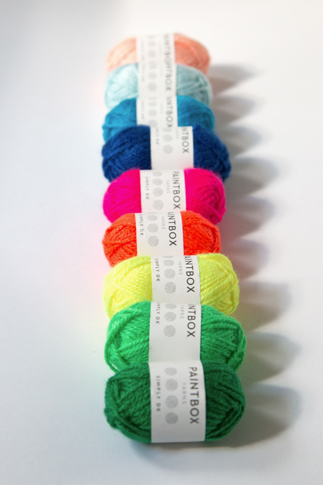
If you’re more of a neon kind of knitter, you can get your psychedelic on with a neon take on Intarsia Mountain. This one is like the primary color version of Intarsia Mountain, but with the volume turned WAY up. This could be a fun one if you want to make Intarsia Mountain for a dorm room, teen room, or if you’ve got that one friend who you just know loves seeing hand-knits done in unexpectedly saturated hues!
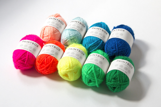
Fun fact: Neon is super hard to photograph! Forgive me.
Dayglow Landscape color palette
Clr A – Peach Orange 854
Clr B – Seafoam Blue 831
Clr C – Royal Blue 840
Clr D – Kingfisher Blue 834
Clr E – Neon Pink 856
Clr F – Neon Orange 857
Clr G – Neon Yellow 858
Clr H – Neon Green 859
Clr I – Grass Green 829
Muted Mountains
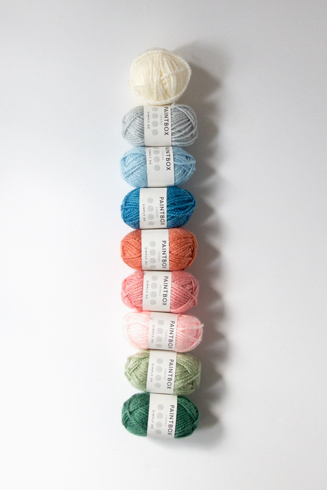
On literally the opposite end of the spectrum is this dustier, more pastel version of the primary color Intarsia Mountain palette. Since I really believe this design would work perfectly in a nursery, I think vintagey pastels are a great option for all the folks out there who want to make Intarsia Mountain for a baby in their lives.
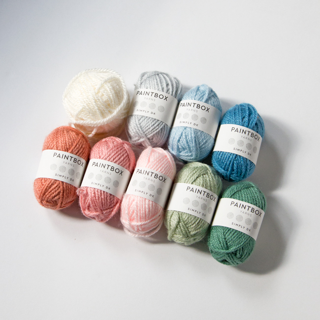
Muted Mountains color palette
Clr A – Champagne White 802
Clr B – Stormy Grey 804
Clr C – Sky Blue 838
Clr D – Duck Egg Blue 835
Clr E – Vintage Pink 855
Clr F – Blush Pink 853
Clr G – Ballet Pink 852
Clr H – Pistachio Green 824
Clr I – Slate Green 826
In the end…
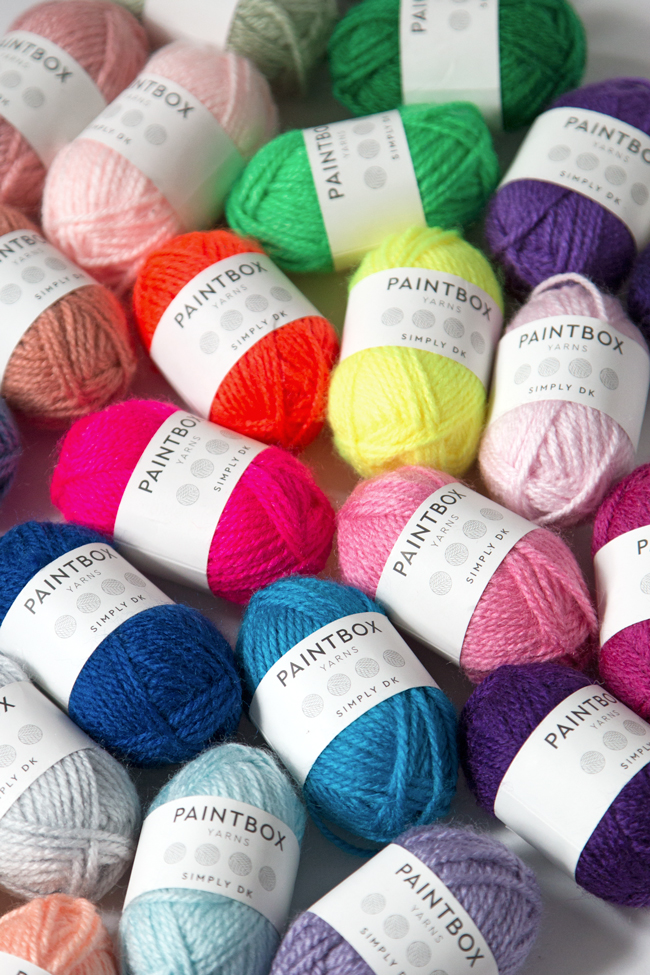
Thanks for indulging me playing with all of these baby skeins Paintbox Yarns sent me during the design process for Intarsia Mountain. Like I said, I’ll dive in to the process behind designing Intarsia Mountain next week here on the blog, but it’s so fun to contemplate the tone change other colors bring to the table for a design that heavily relies on color selection to “work.” If you’ve got other color palette ideas, don’t hesitate to share them on Instagram with #intarsiamountain. A lot of folks have been sharing their own Intarsia Mountain palettes and progress with that hashtag, and it’s SO FUN to see all of the different interpretations!
This post is part of our Read Along Knit Along series & is brought to you by LoveKnitting, Eucalan & Knitter’s Pride. Learn about our sponsors and enter to win the RALKAL prize pack here.




 & shop new patterns


Leave a Reply